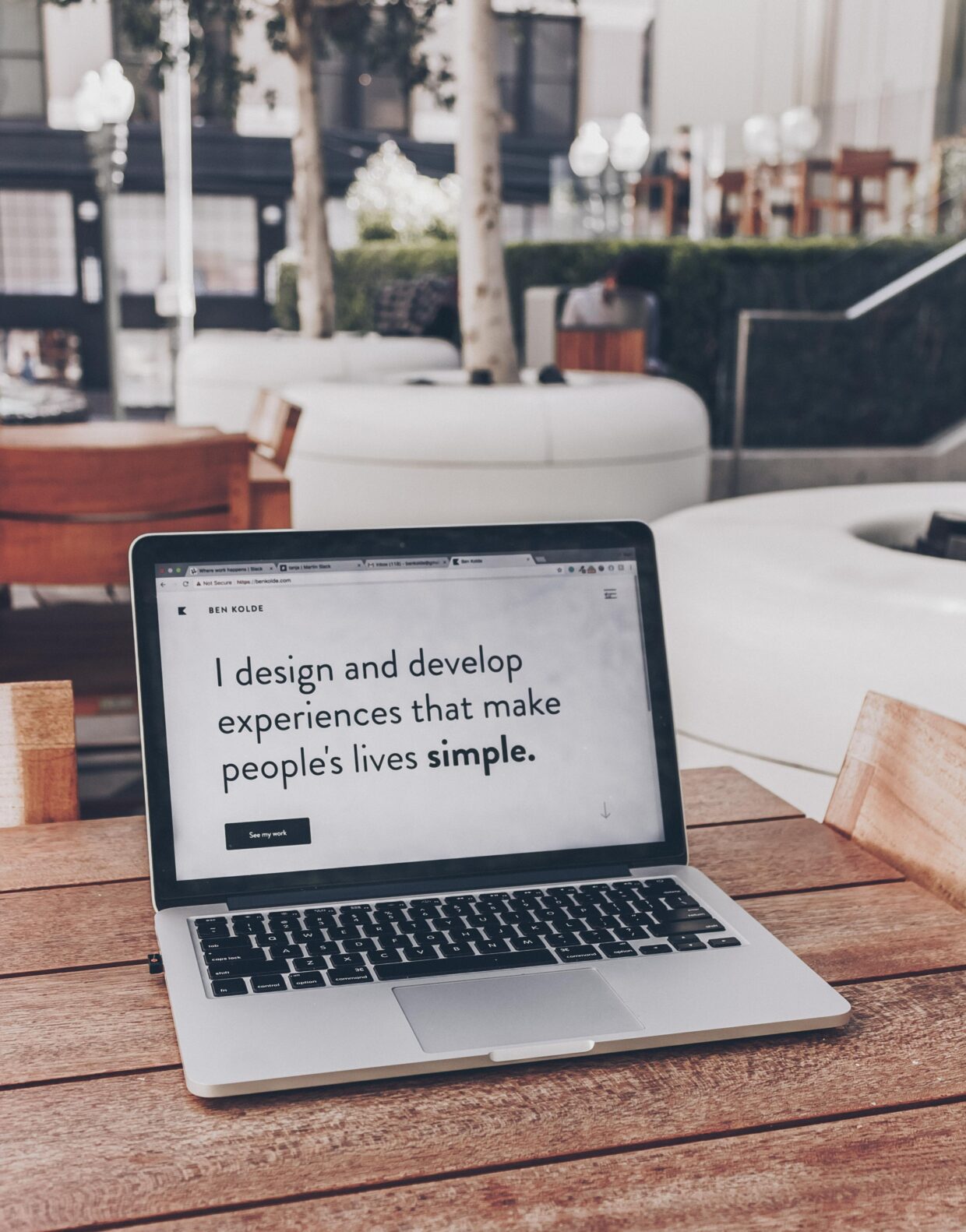
This week we learned about Accessibility and the parameters under which accessible infrastructure and practices can be implemented into society. During class, we watched a video highlighting the various environments, signs, buildings, etc. that can be barriers for folks with various accessibility needs. During class, we put our WordPress websites through an accessibility checker, and my website didn’t do too terribly. It was still very surprising to see how many little details becomes barriers, ones that I missed as well. It can be as simple as the contrast between two colours, the spacing of lines, or even the background colour of your posts.
My experiences with Tech and Accessibility
In university, I haven’t used technology for much outside of submitting papers and making PowerPoints, but I still reflect back and notice some practices that I’ve missed regarding making my presentations as accessible as I can. PowerPoints are the first thing that come to my mind because I try and fit multiple lines on one paragraph and add a small visual with it. I don’t add paragraphs on slides, but I definitely could work on the spacing, font size, and even font choice on my slides. I’ve herd sans-serif fonts are usually safer to use to make the letters easier to decipher. After this class, I will definitely be more mindful of ensuring that simple, yet informative slides that follow the guidelines that have been posted on our class website – are followed. Regarding the absence of tech-accessible practices, it might be because the majority of students don’t fall under the criteria of needing access to super unique supports. I think that provides an unfortunate leeway for some presenters, public figures, YouTubers etc. to get away with appealing to a wider audience without needing to address, and respond to, accessibility concerns. It really should be an innate habit that people practice and implement in and beyond technology. I hope the landscape takes a more dramatic shift towards being more inclusive soon 🙂
How I used accessibility features
The picture below has been made more accessible by using the alt-text feature in WordPress 🙂 I have also re-uploaded the video I made with Matt, last week, below the picture, but I’ve made it more accessible by adding subtitles. I realized that I added on-screen cues last week, which is great! So for this week, I just focused on subtitles (and maybe some more cues?).

This is my video made more accessible by adding text boxes in line with cues in the video.

nicolatheim February 7, 2023
Hi Shefali!
I really enjoyed reading your blog post. First of all, it is nicely structured and well formatted, making it easy and aesthetically pleasing to read. I like how you acknowledged that sometimes you forget about accessibility features in PowerPoint. I too have done this myself, and it’s awesome that you recognize this and are able to be mindful of it for future PowerPoint projects. It’s a good reminder for me as well 🙂
Additionally, the description of the picture with the yellow flower is amazing! It is clear and very detailed. Anyone could read this and visualize what the picture is – very accessible!
I wouldn’t change anything about your post. If I absolutely had to, I wonder if I would change the title. Maybe to something a little more intriguing?? But I think that’s a personal choice.
Shefali, your blog looks awesome! It is well-organized and very visually appealing. Your post looks like it meets all of the criteria. Well done, and thanks for sharing your thoughts!